Top 10 Worst Fast Food Mascots: A Closer Look
The Power of Mascots in Fast Food Marketing
Fast food mascots have long been a cornerstone of branding in the restaurant industry. From Ronald McDonald to the Taco Bell Chihuahua, these characters are designed to create a memorable connection with consumers. However, not all mascots hit the mark. In fact, some have become infamous for their bizarre designs, awkward messaging, or sheer unpopularity. This article dives into the top 10 worst fast food mascots, exploring what went wrong and offering insights into how businesses can avoid similar pitfalls. Whether you’re a marketer, a fast food enthusiast, or simply curious about branding blunders, this list will entertain and inform.
Why Mascots Matter in Branding
Before we dive into the list, it’s essential to understand why mascots play such a critical role in fast food marketing. These characters serve as the face of a brand, embodying its values, personality, and even its menu offerings. When done right, mascots can evoke nostalgia, build trust, and foster loyalty among customers. For example, the Pillsbury Doughboy’s cheerful demeanor has made him an enduring symbol of warmth and comfort.
However, when mascots fail, they can do more harm than good. Poorly executed mascots can alienate customers, confuse brand messaging, or even become the subject of ridicule. As we explore the top 10 worst fast food mascots, keep in mind that these failures often stem from poor design choices, cultural insensitivity, or a lack of alignment with the brand’s identity.
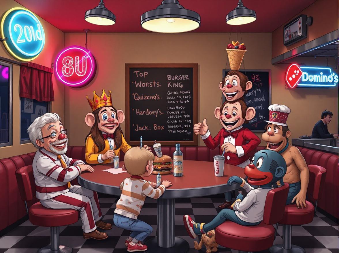
1. The King (Burger King)
Perhaps one of the most polarizing figures in fast food history, The King is Burger King’s mascot—a man with a giant plastic head resembling a king. While the character was initially introduced in the 1970s, it gained notoriety in the early 2000s through a series of unsettling commercials.
These ads featured The King in surreal, often creepy scenarios, such as appearing in someone’s bed or engaging in bizarre activities. Critics argued that the character was too unsettling for children and too strange for adults. Over time, The King became synonymous with discomfort rather than appetite appeal.
Why It Failed: The King’s design and advertising strategy failed to strike a balance between humor and relatability. Instead of creating a lovable mascot, Burger King inadvertently crafted a figure that many found off-putting.
2. Spokespuppet (Quiznos)
In the mid-2000s, Quiznos introduced a series of commercials featuring rodent-like puppets called “Spongmonkeys.” These creatures sang jingles about how much better Quiznos subs were compared to Subway sandwiches.
While the campaign aimed to be edgy and humorous, it backfired spectacularly. Many viewers found the Spongmonkeys grotesque and unappetizing. Instead of drawing attention to Quiznos’ food quality, the ads overshadowed the message entirely.
Why It Failed: The Spongmonkeys lacked any clear connection to the Quiznos brand. Their bizarre appearance and behavior distracted from the product rather than enhancing it.
3. Wendy’s Old-Fashioned Girl (Wendy’s)
Wendy’s iconic red-headed girl is a beloved part of the brand’s identity. However, during a brief rebranding effort in the 1980s, Wendy’s attempted to modernize her image by giving her a makeover. The new version featured a sleeker hairstyle, updated clothing, and a more polished look.
Unfortunately, customers didn’t respond well to the change. Many felt that the updated Wendy lost the charm and authenticity of the original character. Within a few years, Wendy’s reverted to the classic design.
Why It Failed: The redesign alienated loyal customers who had grown attached to the original Wendy. Brands must tread carefully when altering established mascots, as familiarity often breeds affection.
4. Mayohead (Hardee’s/Carl’s Jr.)
In the late 1990s, Hardee’s introduced a bizarre mascot named Mayohead—a talking bottle of mayonnaise with arms, legs, and a face. The character appeared in commercials promoting Hardee’s thickburgers, but its odd appearance and limited appeal made it a flop.
Customers struggled to connect emotionally with a condiment come to life, and Mayohead quickly faded into obscurity.
Why It Failed: Mayohead lacked a compelling backstory or personality. Unlike other successful mascots, it failed to resonate on an emotional level with audiences.
5. Froot Loops Toucan Sam (Kellogg’s)
While Toucan Sam isn’t technically a fast food mascot, his inclusion here highlights the risks of overexposure. Originally created to promote Froot Loops cereal, Toucan Sam became so ubiquitous in Kellogg’s marketing that he began appearing in cross-promotional campaigns with fast food chains like Burger King.
Over time, the character’s repetitive catchphrase (“Follow my nose!”) grew tiresome, and his presence in unrelated promotions diluted his effectiveness.
Why It Failed: Overusing a mascot can lead to fatigue among consumers. Brands must ensure that their mascots remain fresh and relevant to maintain engagement.
6. The Noid (Domino’s Pizza)
The Noid was Domino’s answer to the challenge of delivering hot pizzas quickly. Introduced in the 1980s, this claymation character wreaked havoc on pizza deliveries, only to be thwarted by Domino’s efficient service.
While the concept was clever, The Noid’s menacing appearance and chaotic antics made him less endearing than intended. Additionally, a real-life incident involving a mentally unstable individual naming himself after the character led to the mascot’s retirement.
Why It Failed: Associating a mascot with negative behavior or events can tarnish a brand’s reputation. The Noid serves as a cautionary tale about the unintended consequences of creative decisions.
7. Chester Cheetah (Cheetos)
Chester Cheetah, while widely recognized today, faced criticism in his early years for being overly aggressive and predatory. His initial portrayal as a sly, cunning cheetah clashed with the playful nature of Cheetos’ target audience—children.
Over time, Chester evolved into a friendlier, more approachable character, but his rocky start highlights the importance of aligning a mascot’s traits with the brand’s values.
Why It Failed: Misalignment between a mascot’s personality and the brand’s intended image can confuse consumers and weaken brand loyalty.
8. Little Caesars’ Caesar Character
Little Caesars’ mascot—a caricature of Julius Caesar wearing a chef’s hat—has always been somewhat ambiguous. While the character fits the brand’s Roman-inspired theme, his minimal screen time and lack of distinct personality make him forgettable.
Unlike other mascots on this list, Little Caesars’ Caesar doesn’t necessarily offend or repel customers. However, his blandness prevents him from standing out in a crowded market.
Why It Failed: A lack of personality and engagement makes a mascot ineffective. To succeed, mascots need to capture attention and leave a lasting impression.
9. Colonel Sanders’ Reimagined Versions (KFC)
Colonel Sanders is one of the most recognizable figures in fast food history. However, KFC’s decision to periodically replace the Colonel with celebrity impersonators or exaggerated caricatures has sparked controversy.
For instance, a 2015 ad campaign featured Darrell Hammond as a bumbling, eccentric version of the Colonel. While some viewers found it amusing, others felt it disrespected the legacy of the original Colonel.
Why It Failed: Reimagining a beloved mascot without respecting its roots can alienate longtime fans. Consistency is key to maintaining brand equity.
10. Jack Box (Jack in the Box)
Jack Box, the clown-headed CEO of Jack in the Box, has divided opinions since his debut in the 1980s. While some appreciate his quirky humor and self-awareness, others find him unsettling due to his exaggerated features and deadpan delivery.
Additionally, Jack’s frequent appearances in dark or surreal storylines have drawn criticism for being inappropriate for younger audiences.
Why It Failed: Pushing boundaries with a mascot can backfire if it alienates core demographics. Striking the right tone is crucial for success.
Lessons Learned: How to Avoid Creating a Flop
Now that we’ve explored the top 10 worst fast food mascots, let’s discuss actionable tips for avoiding similar mistakes:
- Know Your Audience: Understand who your target demographic is and tailor your mascot accordingly.
- Stay True to Your Brand: Ensure your mascot reflects your brand’s values and mission.
- Test Before Launching: Conduct focus groups to gauge reactions before rolling out a new mascot.
- Evolve Thoughtfully: If updating an existing mascot, make gradual changes to preserve familiarity.
- Avoid Controversy: Steer clear of designs or narratives that could offend or alienate customers.
Conclusion: Turning Mascot Mishaps Into Marketing Wins
The top 10 worst fast food mascots remind us that even the biggest brands can stumble when it comes to character creation. By learning from these missteps, businesses can craft mascots that truly resonate with their audience. Remember, a great mascot isn’t just a logo—it’s a living embodiment of your brand’s identity.
So, whether you’re brainstorming ideas for your next marketing campaign or simply reminiscing about fast food history, take note of these lessons. After all, the difference between a memorable mascot and a marketing disaster often comes down to thoughtful planning and execution.
What are your thoughts on these infamous mascots? Do you think any deserve a second chance? Share your opinions in the comments below!