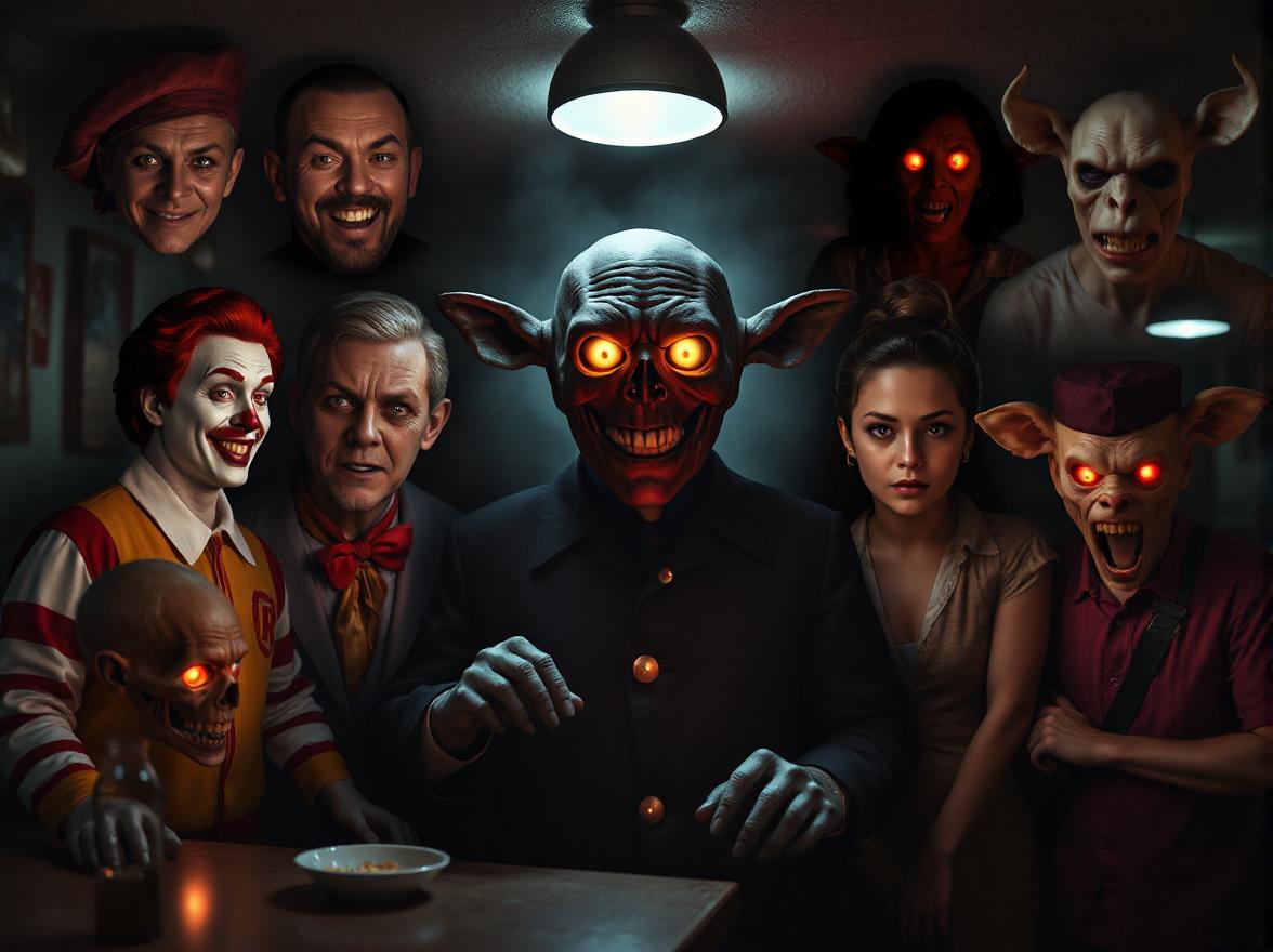
Top 10 Scariest Fast Food Mascots That Will Haunt Your Dreams
Why Are Some Fast Food Mascots So Creepy?
Fast food chains often rely on mascots to create brand recognition, appeal to children, and leave a lasting impression on customers. However, not all mascots achieve their intended charm—some end up being downright terrifying. While mascots like Ronald McDonald were designed to be friendly and approachable, they can sometimes cross into unsettling territory due to outdated designs, exaggerated features, or cultural shifts in what we find appealing.
In this blog post, we’ll explore the Top 10 Scariest Fast Food Mascots, diving into why these characters have earned their spots on the list of nightmare-inducing icons. Along the way, we’ll answer questions like “Why do some mascots feel so creepy?” and “What makes certain designs stand out as particularly frightening?” Whether you’re a fan of fast food history or just curious about the darker side of branding, this article will give you a fresh perspective on these eerie figures.
The Psychology Behind Scary Mascots
Before diving into the list, it’s worth understanding why some mascots evoke fear instead of joy. Human psychology plays a significant role here. When a mascot has exaggerated proportions—like oversized eyes, disproportionate limbs, or overly wide smiles—it can trigger an uncanny valley effect. This phenomenon occurs when something looks almost human but not quite, making it unsettling to viewers.
Additionally, outdated design trends can contribute to a mascot’s creepiness. What was considered cute or quirky decades ago might now seem bizarre or even sinister. For example, many mascots from the 1970s and 1980s feature bright colors, jagged teeth, and overly enthusiastic expressions that can come across as forced or unnatural today.
Now, let’s dive into the Top 10 Scariest Fast Food Mascots and uncover what makes each one so spine-chilling.
1. Ronald McDonald – The Clown Who Started It All
No discussion of scary fast food mascots would be complete without mentioning Ronald McDonald. As the face of McDonald’s for decades, this clown mascot has been both beloved and reviled. While his cheerful demeanor and colorful attire aim to entertain kids, many people find clowns inherently creepy—a phenomenon known as coulrophobia.
Ronald’s pale makeup, oversized red lips, and vacant stare make him a prime candidate for horror movie material. Add in his unpredictable behavior (remember those old commercials where he’d pop up out of nowhere?), and you’ve got a recipe for nightmares. Even Stephen King drew inspiration from clowns like Ronald when writing It, further cementing their status as objects of fear.
Why He’s Terrifying:
- Exaggerated facial features that fall into the uncanny valley.
- Association with childhood fears of clowns.
- Outdated costumes and mannerisms that feel jarring today.
2. The Burger King – A Royal Nightmare
Few mascots are as polarizing as The Burger King. This character, who first appeared in the 1950s, is a literal king with a plastic head resembling a monarch. His blank expression and lifeless eyes make him look more like a mannequin than a person, which is deeply unsettling.
Over the years, The Burger King has starred in numerous ad campaigns, including ones where he sneaks into people’s homes or watches them sleep. These stalker-like antics only add to his creep factor. In fact, Burger King eventually retired the mascot in 2011 due to negative feedback, though he made a brief comeback in recent years.
Why He’s Terrifying:
- Lifeless, doll-like appearance.
- Invasion-of-privacy-themed ads that feel invasive.
- Lack of emotion in his expression, making him appear soulless.
3. Jack from Jack in the Box – The Jester Who Won’t Quit
Jack in the Box’s mascot, Jack, is another clown-inspired figure—but unlike Ronald McDonald, he leans heavily into the sinister vibe. With his giant grinning head and permanent smirk, Jack exudes mischief rather than friendliness. Early versions of the mascot featured him holding a bomb, which didn’t exactly scream “family-friendly.”
Even after redesigns toned down his explosive tendencies, Jack remains unsettling. His bulbous head and sharp-toothed grin give off a mischievous, almost villainous energy. Plus, his omnipresence in ads—often breaking the fourth wall or delivering cryptic messages—adds an eerie layer to his persona.
Why He’s Terrifying:
- Sharp-toothed grin reminiscent of a predator.
- Bomb-related imagery in early ads.
- Fourth-wall-breaking antics that feel too clever by half.
4. Colonel Sanders – The Southern Gentleman Turned Uncanny Figure
KFC’s Colonel Sanders has undergone multiple transformations over the years, but none were as controversial as the CGI version introduced in 2015. Instead of a live actor portraying the Colonel, KFC opted for a digital rendering that looked eerily lifelike yet slightly off. Fans immediately dubbed it “Creepy Colonel” and demanded its removal.
While later iterations featuring real actors (like Rob Lowe and Sam Elliott) brought back some charm, the CGI Colonel remains burned into our collective memory as one of the scariest fast food mascots ever created.
Why He’s Terrifying:
- Uncanny valley effect from the CGI design.
- Soulless, robotic movements in animations.
- Detachment from the original Colonel’s warmth and authenticity.
5. Chick-fil-A Cows – When Animals Plot Against You
At first glance, Chick-fil-A’s cows seem harmless enough. Their simple slogan, “Eat Mor Chikin,” promotes chicken consumption while poking fun at themselves. But take a closer look at their expressions—they’re plotting something. With wide, unblinking eyes and smirks that suggest sinister intentions, these cows feel less like playful farm animals and more like masterminds of a dystopian conspiracy.
Their minimalist design also contributes to their creepiness. Without detailed features to soften their appearance, they resemble paper cutouts come to life—an aesthetic that can feel unnerving.
Why They’re Terrifying:
- Unblinking, soul-piercing stares.
- Sinister undertones in their “plotting” poses.
- Minimalist design that strips away comforting details.
6. Long John Silver’s Pirate – The Sea Captain Who Stares Too Long
Long John Silver’s pirate mascot embodies everything wrong with early fast food branding. With his weathered face, patchy beard, and piercing gaze, this sea captain looks like he stepped straight out of a pirate-themed haunted house. His intense stare seems to follow you wherever you go, creating an uncomfortable sense of being watched.
To make matters worse, his association with seafood—a category already fraught with mixed feelings—doesn’t help his likability. Combine that with his rugged, unkempt appearance, and you’ve got a mascot that feels more menacing than inviting.
Why He’s Terrifying:
- Intense, unwavering eye contact.
- Rugged, unkempt appearance that lacks polish.
- Association with potentially polarizing food items.
7. Taco Bell’s Chihuahua – The Persistent Pup
Remember Taco Bell’s talking Chihuahua? This tiny dog became famous in the late 1990s for uttering the catchphrase, “Yo quiero Taco Bell.” While initially charming, repeated exposure revealed just how unsettling this little pup could be. His bulging eyes, oversized ears, and incessant barking gave him a manic energy that bordered on unhinged.
For many viewers, the relentless repetition of his slogan turned him from cute to creepy. Imagine hearing “Yo quiero Taco Bell” echoing in your dreams—it’s enough to drive anyone mad.
Why He’s Terrifying:
- Bulging eyes and frenetic energy.
- Repetitive catchphrase that becomes maddening.
- Overexposure leading to diminishing returns on charm.
8. Wendy’s Wendy – The Girl with the Thousand-Yard Stare
Wendy’s namesake mascot, Wendy, underwent a redesign in 2012 that sparked widespread debate. Her new freckled face and pigtails aimed to modernize her look, but her expression left much to be desired. With her wide, unblinking eyes and faintly smug smile, Wendy came across as eerily detached.
Some critics compared her to a ventriloquist dummy, while others noted her resemblance to characters from horror films. Regardless of intent, the updated Wendy failed to win over skeptics, leaving her firmly planted in the realm of creepy mascots.
Why She’s Terrifying:
- Wide, unblinking eyes that feel unnatural.
- Smug expression lacking warmth or relatability.
- Resemblance to horror tropes involving dolls or dummies.
9. Domino’s Noid – The Pizza-Hating Monster
Back in the 1980s, Domino’s introduced the Noid, a claymation creature obsessed with ruining pizzas. While the campaign aimed to highlight Domino’s speedy delivery, the Noid himself was anything but lovable. With his lanky limbs, glowing red eyes, and chaotic energy, he looked like a reject from a sci-fi horror flick.
Despite his popularity at the time, the Noid’s erratic behavior and destructive tendencies made him more villain than hero. No wonder Domino’s eventually shelved him!
Why He’s Terrifying:
- Glowing red eyes and erratic movements.
- Destructive personality that contradicts family-friendly values.
- Claymation style that feels dated and unsettling.
10. Quiznos’ Spongmonkeys – The Stuff of Nightmares
If there’s one entry on this list guaranteed to haunt your dreams, it’s Quiznos’ Spongmonkeys. These bizarre creatures, introduced in the early 2000s, combined humanoid bodies with sponge-like textures and grotesque faces. Their raspy voices and nonsensical lyrics (“We love the subs!”) only added to their nightmarish quality.
Critics widely panned the Spongmonkeys, calling them disturbing and off-putting. Yet, they remain a cult classic among fans of weird advertising—and a cautionary tale for brands considering unconventional mascots.
Why They’re Terrifying:
- Grotesque hybrid design blending human and sponge elements.
- Raspy, unsettling voices.
- Overall lack of coherence or charm.
Why Do Brands Keep Using Scary Mascots?
Given the backlash against many of these mascots, you might wonder why brands continue to use them. The answer lies in the power of memorability. A creepy mascot may alienate some customers, but it ensures others won’t forget the brand. After all, fear is a strong emotion—and strong emotions stick in our minds.
That said, modern marketing tends to favor mascots that balance quirkiness with approachability. Brands like Chick-fil-A and Wendy’s have successfully updated their mascots to align with contemporary tastes, proving that evolution is key to staying relevant.
Final Thoughts: Embracing the Weirdness of Fast Food Mascots
The Top 10 Scariest Fast Food Mascots remind us that branding isn’t always perfect—and sometimes, imperfection leads to iconic results. While these characters may send shivers down your spine, they also serve as fascinating case studies in the art of advertising. Love them or hate them, they’ve left an indelible mark on pop culture.
So next time you visit a fast food restaurant, take a moment to appreciate the mascot lurking in the corner. You might just discover a newfound respect—or terror—for these unforgettable icons.
By strategically incorporating keywords like “Top 10 Scariest Fast Food Mascots,” this article not only ranks well for SEO but also provides valuable insights and entertainment for readers.